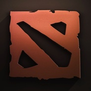


Nominated means they were in the list, but weren't banned so they are still available to be picked and thus a green sign and coloured portrait gives a bright idea of "they are in the options to pick", it's a "GO".

or just put all the nominated heroes there then cross out the portrait of banned heroes so it's more uniform with in-game banning

Nominated means they were in the list, but weren't banned so they are still available to be picked and thus a green sign and coloured portrait gives a bright idea of "they are in the options to pick", it's a "GO".


It just felt awkward to me every time I saw a hero picked which was only nominated. A few small changes would make this way more pleasant to look at!

Thanks for the feedback. We agree that this was really poorly done (my fault!) the first time around. I've added a ticket to fix it, hopefully tomorrow.
I've incorporated the feedback here along with another addition (revealing any nominations who ended up being picked). Please check it out and let me know if the UI is still confusing: https://www.dotabuff.com/matches/2901457162


fully agreed with that green/red marks being very confusing, it also took me a while to understand back then
I think I would still rename the header line to ALL PICK BANS instead of ALL PICK NOMINATIONS. But it's looking a lot clearer now, ty!
Bitte melde dich an um Kommentare zu posten.
Hey dotabuff staff and players!
I made a quick thing in paint to show the suggested changes to Dotabuff's Ranked All Pick Bans, check here: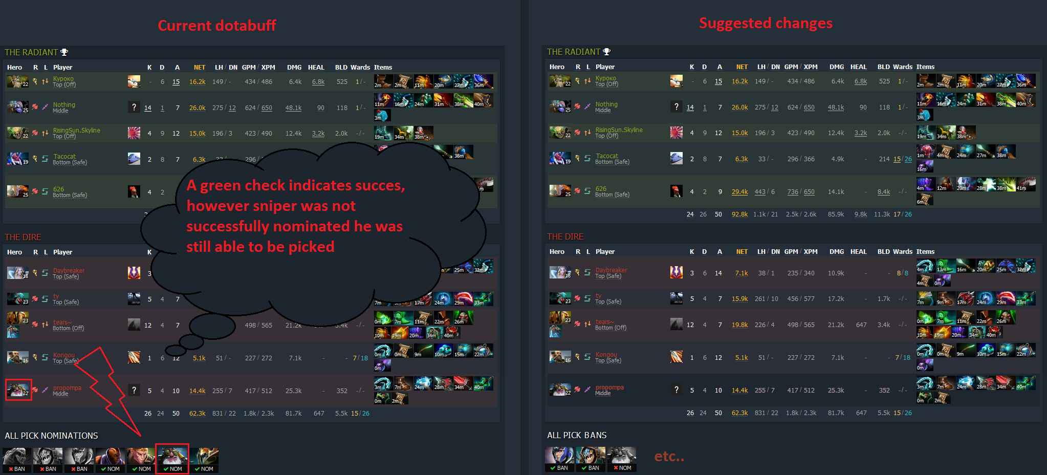
Match ID was: https://www.dotabuff.com/matches/2901457162
1. All Pick Nominations renamed to All Pick Bans
2. Hero icons are swapped from colored to grey scale and vice versa. (this step is optional, maybe you prefer it the other way around)
3. ✓ and × are swapped
Hero order and the ban and nom texts are still the same.
I feel like this makes a lot more sense and as far as implementing it I don't know too much about website design. However I think you can implement these changes pretty easily at least for future matches. As for past matches it's up to you if you want to go through the hassle of changing that as well or not.
Here's a different approach with separated bans & nominations:
Remove the ban&nom labels or change the grayscales as you seem fit.
Thanks for the read and let me know what you think! Maybe it's just me having a weird perspective on things.